About the project
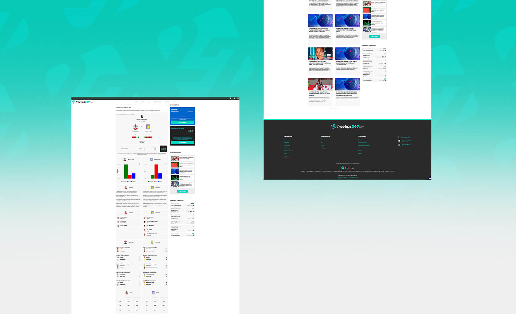
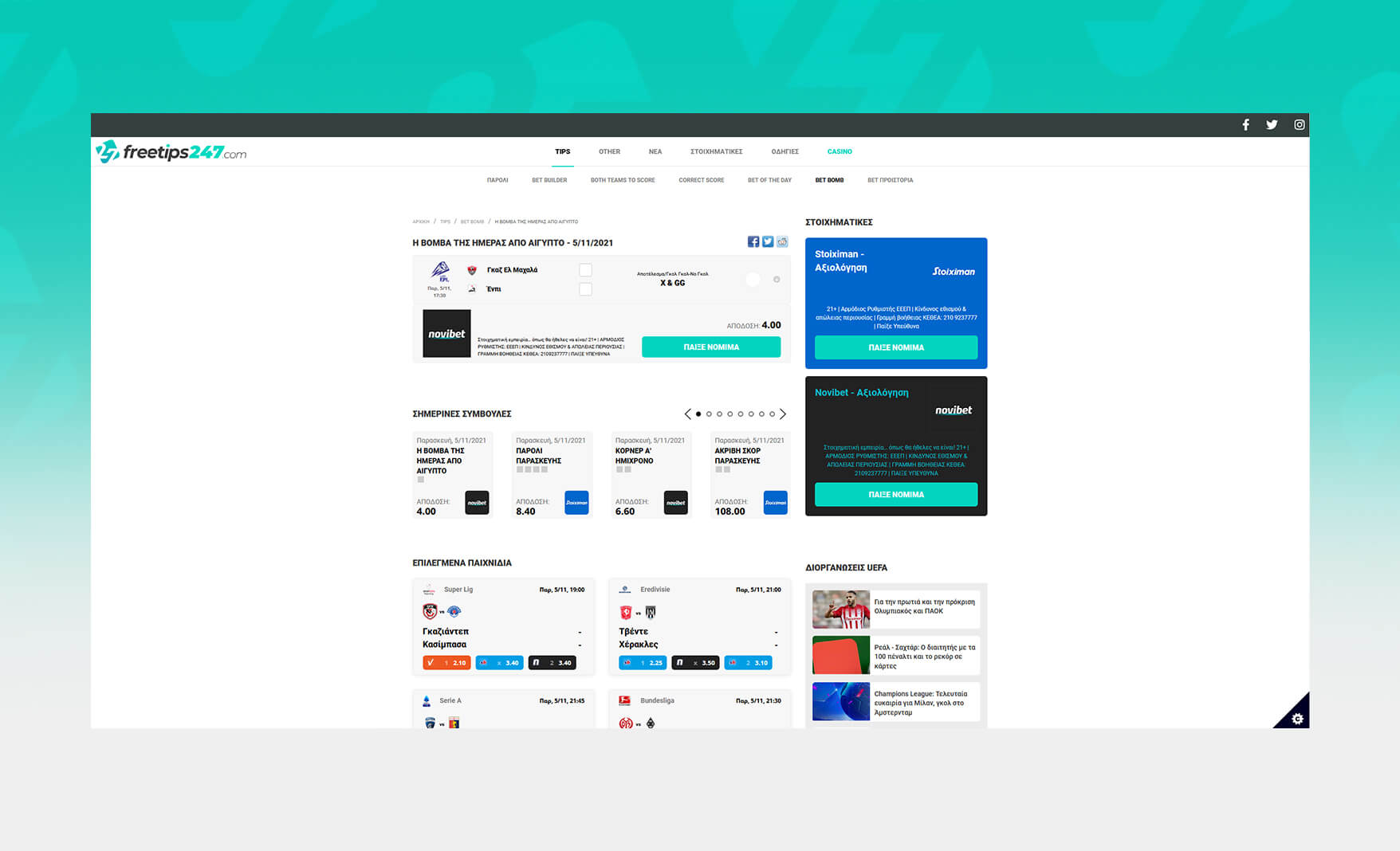
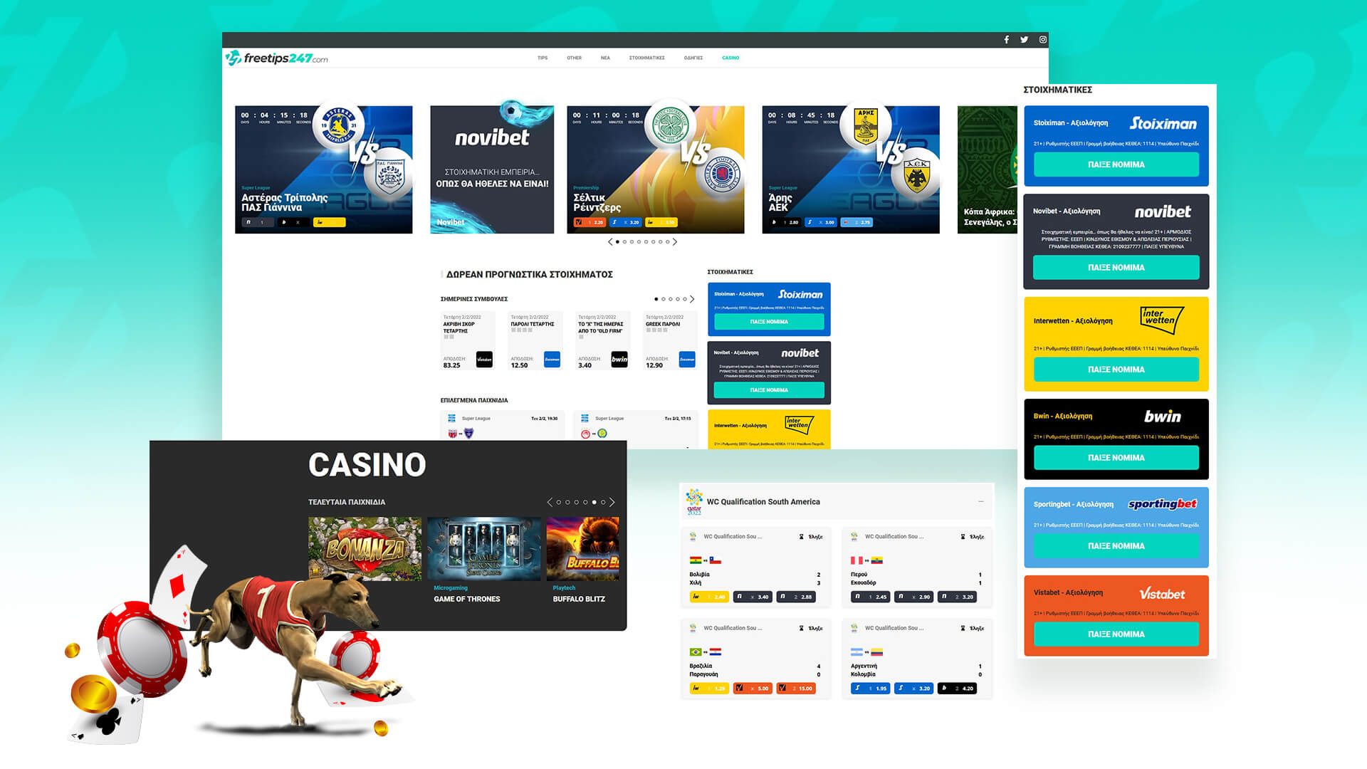
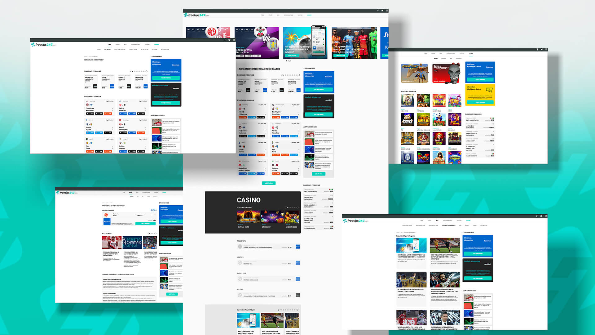
Our goal was to make the user experience easy to use - navigate and to be visually clean - organised .
When someone lands on the Freetips247 site, two things should instantly be clear: what they do and what they want the visitor to do.So that's exactly what we did. From the logo to the colors we chose, everything is cohesive. This helps people identify and remember the Freetips247 brand.
- Freetips247
- Since 2020
- Website
- https://www.freetips247.com
Next Project
Asteras anniversary jersey

